
BLOOM MED CASE STUDY
The concept is to create an application that will help people take their medication on time, and in the correct amount. Many people today are taking medication daily, sometimes multiple times per day. These medications range from ADHD medication, birth control, vitamins, allergy medication, blood sugar control, and many more medications. People have a hard time remembering when to take their medication. They have an even harder time if they feel alright, and may not feel the need to take their medication all the time. The idea behind this app is to try and make a game of taking medication on time, and in the correct amount. The app will also try to manage the impulse of some people who might want to over take their medication if they want to “win”, and will assist people in knowing what to do if they miss a dose, or are late.
The application will need to have some potential safeguards added. For instance, for juveniles, there should be a parental (or guardian) control. Also, it might be possible to have the data provided to health care providers, under some circumstances.
PROJECT OVERVIEW
CHALLENGE
Most people take medications, and most of the people who are taking medications have problems remembering to take their medication. Medication does not work as well if it is not taken consistently.. The challenge of Bloom Med is to create an application that people will want to use, and will help people rem.ember to take their medications
SOLUTION
Design application for Bloom Med
Create an app that can schedule complex schedule
Create new logo and branding
DURATION
80 hours in 4 weeks
SCOPE
Design application and new branding
TOOLS
Sketch, Invision, Post-it Notes, Pencil & Paper
ROLE
UX designer (research, visual design, interaction design, user testing)
PROCESS
This is the outline of the process to create the product in this project. Outlining the process at the outset of a project helps to organize the steps, and ensures an orderly progression to a final product. I conducted research, defined the requirements for the app, created ideas of features for this app, created a prototype and tested and improved this prototype to a final product which could be handed off to a development team.

RESEARCH
Research that I conducted was either secondary research using trade journals, information on competitors, and other information, or primary research, interviews of potential and current users of medication minder apps. The reason to conduct research is to make sure that the final product will address the needs of users, filling needs left by other products, but using industry standards. I conducted literature research, for secondary data, and developed test plans, selected, and interviewed users, and summarized the data for primary research.
SECONDARY RESEARCH
This research is market and user research. This research allows a rapid identification of potential users, and problems that these users have that are not being addressed by current products. I conducted literature research using government and industry sources, and investigated potential users, direct and indirect competitors, and the overall industry dealing with people forgetting to take their medications.
MARKET RESEARCH AND USER DEMOGRAPHICS
CBS reported that 70% of Americans take at least one prescription drug, and 50% take two or more (https://www.cbsnews.com/news/study-shows-70-percent-of-americans-take-prescription-drugs).
27% of people aged 18-29, 40% of people 30-49, 615 of 50-64 year olds, and 88% of people 65 and older take prescription medication.
86% of Americans take supplements. The CDC estimates that something like 25-30% of people correctly take their medications
The journal Care Clinic (https://careclinic.io/medication-compliance/) discussed problems with not taking all the medication as prescribed. The largest problem that healthcare professionals see for this is that when people do not take their medication, they may need more treatment, or other interventions like surgery or other things, which are more expensive. Also, people do not get the benefit of their medication, and could have avoided medical problems
Grandview research reported (https://www.grandviewresearch.com/industry-analysis/mhealth-app-market) that the market for health apps in 2018 was about $12.4 billion, and that it is going to expand 44.7% between 2019 and 2026.
COMPETITIVE ANALYSIS
The competitive analysis shows strengths and weaknesses of direct and indirect competitors. It is important to incorporate the strengths of competitors to ensure that the app is a high functioning product, and to examine the competitors’ weaknesses to see where the new Bloom med can exceed user expectations. I used literature research, along with user reviews and personal testing of these apps to determine their strengths and weaknesses.
PROVISIONAL PERSONAS
Provisional personas were created for three potential users of this app. These personas help direct the development of survey instruments for users. I created these by trying to represent typical users who have different problems in remembering to take their medications, as identified in my literature research.
PRIMARY RESEARCH
I collected data by interviewing potential users of a medication reminder app. Primary research data gives insight into the potential users goals, motivations, needs and pain points, providing insight from real people that is directly applicable to my project. I prepared a test plan that included targeted demographics and number of users, and a script for questions contacted potential users, interviewed them and recorded these interviews, transcribing the interviews into notes.
USER INTERVIEWS
PARTICIPANTS: 5 participants
PARTICIPANT AGES: 19-60 years old.
Most participants had used navigation products before.
EMPATHY MAP
This arrangements of post-it notes shows areas where multiple interviewees had similar thoughts about medication reminders. These areas of agreement provide insights that can be used to form the basis of understanding the needs of users,. I took the transcripts of user interviews, and wrote individual comments on post-it notes, then grouped these comments by the similarity of their impact and found insights, and the needs that these users were expressing.
INSIGHTS:
1.To easily make multiple schedules
2.To communicate with caregivers
3.To have unique, memorable reminders
4.To have an app that is interesting and fun to use.
NEEDS:
1.To easily make multiple schedules
2.To communicate with caregivers
3.To have unique, memorable reminders.
4.To have an app that is interesting and fun to use.
USER PERSONA
The final persona is a depiction of a single user, Lisa Oliver, whose characteristics are those of the users who were interviewed. The user persona is a powerful tool to ask how we might answer Lisa’s needs. The persona was made using demographic information from the potential users who were interviewed, and the persona’s goals, frustrations, and needs were the goals frustrations and needs identified by interviews and the empathy map.
DEFINE
The definition phase of the project is where the features and functions of the app are defined. Defining the functions permits design of an app that meets users needs. This is done by creating a point of view statement form the persona and asking how we might meet the Lisa’s defining the business and users’ goals, and creating a roadmap for the features in the app.
POV & HMW STATEMENTS
This table shows insights and needs of the users, and restates them in the point of view of Lisa, the persona, and asks how we might satisfy her needs. This is important, because it focuses the needs statements on solving Lisa’s problems. To make this I took the insights and needs from the user interviews and re-wrote them to put them into Lisa’s point of view, and created questions to be used in brainstorming features to answer her needs.
USER AND BUSINESS GOALS
This is a Venn diagram comparing the goals of the business and users of a medication reminder app. Features that satisfy the goals that are shared between the business and users are goals that should be a high priority. I found the business goals in doing research in the industry and competitors, and the users’ goals from the interviews, and organized these goals into the Venn diagram.
PRODUCT ROADMAP
This roasmap lists the features with a short description and the research that supports adding the feature, in priority order. This is important to ensure that the most important features are included in the app. This was done by brainstorming application features that would solve Lisa’s problems, and arranging these features in priority order based on their ability to meet the overlap goals of the business and users.
INFORMATION ARCHITECTURE
The way that information is organized, displayed and accessed is decided in this phase. A good information architecture makes the placement of features and information seem intuitive and logical, while poor information architecture will make an application appear disorganized. The primary tool to describe the information architecture is the development of an application map.
APPLICATION MAP
This application map shows the screens that will need to be designed and the relationship between the screens and the features. This map is the first step toward the realization of a user friendly application. I used the best practices in the indsustry based on the strengths of competitor apps, and standard practices in the health and medication reminder application space.
IDEATE
The ideation phase is where the basic design is assembled. The ideas for the design are assembled and organized into a useful and concepts for the production of an application to answer the users’ needs. Ideation involves organizing the essential tasks that the users must accomplish, charting the flow of the user’s actions through these screens, and beginning to organize the features ad content visually.
TASK FLOW
This is a flow chart showing everything the user will need to do to perform the tasks of scheduling a medication, notifying a pharmacy that a refill is needed, setting up a notification for a caregiver if the medication has, or has not been taken, and earning a reward in the game aspect of the app. These are the most important tasks based on the product roadmap. I used industry standard arrangements of screens and features and arranged the Bloom Med features to create logical steps for each task, being mindful to created pathways that would require the minimum number of user inputs to accomplish.
USER FLOW
The user flow shows how a user would move from task to task, or move through the app to accomplish several tasks. This gives an idea of the pages and places that a user would need to visit, and what information must be included in each. This is done by looking at a list of tasks, and using the application map as a guide to the pages, and charting a users progress through these pages and functions to complete required tasks.
INTERACTION DESIGN
The way that users interact with the app is determined by the layout of the application screens. These layouts determine in large part how the app will act, whether it will be intuitive and useful, and the look and feel of the app. I began designing low fidelity wireframes, that are rapid pen and ink sketches, then improved the fidelity with a number of tools, and added concepts such as mood, style, and user interface objects to result in a high fidelity wireframe that will show how the interactions will occur.
LOW FIDELITY WIRE FRAMES
I drew sketches of the application screens by hand to represent the location of important features and functions. Paper and pencil sketches of an application are a rapid way to try out ideas, and make sure that the overall layout and concept of an app are pleasing, and useful. I used a template depicting a modern telephone screen, and examined competitors and other industry standard applications to determine useful, and functional layouts for important screens that enable the user to complete critical tasks.
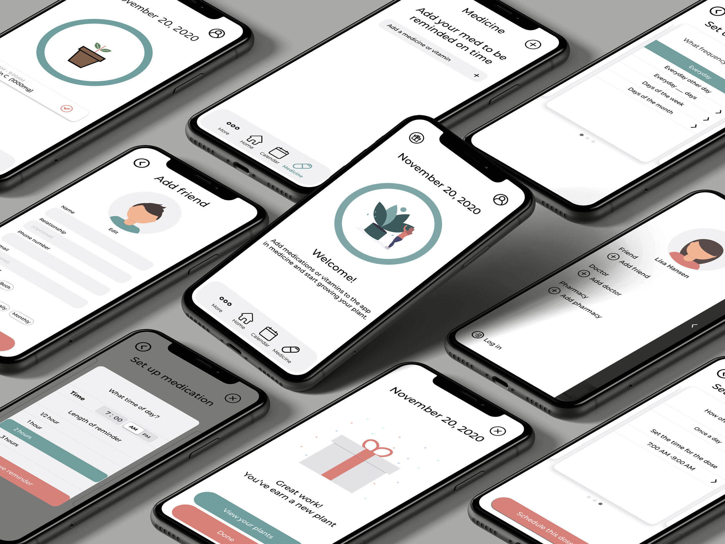
PROTOTYPE
Prototypes require a set of wire frames, which are then linked to allow the user to click on different locations on the screens, to see how the app will function. If pain points are caught at the prototype stage, then can be fixed while still in the design phase. I created a set of mid-fidelity wire frames, and used a prototyping tool to make some of the critical functions clickable.
MID-FIDELITY WIRE FRAMES AND PROTOTYPE
These wireframes show containers in place of images and specific text, with some of the functions labeled, and the prototype has been made from these screens and allows the user to click on the area of the screen to show the functionality. Mid-fi wire frames that have linked into a prototype allow users to evaluate the app, without the distraction of colors, specific text to focus on the functioning of the app.
Usability Testing
I tested the prototype, with a group of potential users, and I conducted tests of the prototype. Testing of the prototype is done to see whether users had any problems with the prototype, or the prototype had any problems that caused errors, Usability testing is done to identify problems that can be fixed at the wireframe and prototype stage, . I wrote a research plan including a script so that the users could conduct three tasks with the prototype, recruited 6 users who use medications, and conducted this testing over Zoom and Skype. I conducted moderated testing which is watching their actions, and recording their comments. I then transcribed these comments and gathered statistics on the errors that they made, and their ability to complete the tasks.
Affinity Map
The results of user testing of the prototype were organized to allow recognition of clusters of pain points among users. It it important to see of there are features or functions that cause difficulty for groups of users so that these may be improved in subsequent iterations of wire frames and prototypes. I developed a test plan, selected users based on demographics identified in the research, created a script to guide these testers through the prototype, conducted moderated testing, recording the results, creating transcripts, putting the individual comments and errors on post-it notes, and then arranging these in groups which provided insights into the users needs and pain points.
Insights:
1. Spelling and images need to be corrected
2. Calls for action should only appear when they are needed.
3. The icons need to be clear and not similar to other icons.
4. The menu items need to be clear and unique.
5. Navigation functions should be clear.
6. The alarm should be able to be timed before or after the medication, and permit more than one alarm
Needs:
1. Correct editorial errors
2. Remove the “Schedule this Dose” call for action from all pages until it will be used.
3. Redesign the achievement icon, and add other navigation bar icons.
4. Re-label the menu items to make them more clear.
5. Make sure that navigation functions are clarified.
6. Add before or after options to the alarm reminders, and allow multiple reminders.
MOOD BOARD
The Bloom Med mood board depicts the mood that the app will give the users. The Bloom Med mood is a key component representing the brand identity. I looked at the characteristics of Bloom Med, contacting with caregivers, and gamification, and determined the brand mood of Bloom Med, which is fun, healthy, and calming, and the mood board, then selected colors, typography, developed a logo, and selected interfaces which promote this mood, bu using designer websites for industry standards for these elements.
Style Tile and UI Kit
The Bloom Med style and user interface are represented in the elements on the style tile and user interface (UI) kit. The style tile and UI kit are a guide, for development of high-fidelity wire frames, and can be used by app developers. I created the style tile and UI kit, by looking for industry standards for font, color palette, and selected industry standard icons, and other features, which were consistent with Bloom Med’s mood and brand identity.
REVISION RECOMMENDATIONS:
User testing of my prototype led to 4 changes that should be done to improve the features
1. Add an accept or cancel options (icons) to the screen dimmer time menu.
2. Other pop up menus shrink the navigation screen temporarily until they time out.
3. Quick Navigation was mis-named, and should be re-named.
4.add an On or off indicator to the icons on the quick navigation menu.
FINAL WIRE FRAMES
These high fidelity wire fames represent the look of the final application. High fidelity wire frames may be used for further evaluation and testing to ensure that the design handed off to developers will be useful, and functional. The final wre frames were developed from the mid-fidelity wife frames, incorporating the recommendations from the affinity map, and applying the mood, style and UI elements.
Updated Prototype
I updated my prototype to include the recommendations from user testing, and to correct a couple of minor issues that I found. The prototype will be a partially clickable example of how the app will work, and will show how it looks once it goes live. I made this from the corrected final wireframe, using Invision to create a prototype.
Conclusion
I have experience with myself and members of my family forgetting to take medications. I conducted research into this problem and found that it is a very common problem and is considered a public health problem. I conducted research into medication users, and apps already in the field of health, and medication reminders. I created provisional personas for possible users, and examined in depth several of the direct and indirect competitors in this space. I interviewed users and found pain points and insights into the needs of potential users. From these I developed a final persona, and formed questions of how might we answer the users needs in the voice of the persona. I brainstormed solutions to the needs of the final persona and created an information hierarchy. I looked at the business and user goals, and mapped them to assist in arranging a hierarchy of the needs of possible features. I then began mapping out an application, and the flow that would be required to accomplish important tasks that I identified. I also mapped the users flow through the application to understand how they would interact with the app. I created a set of low fidelity wireframes, then further developed these into mid fidelity wireframes, which were linked in a prototype. I created a test plan, and tested the prototypes with several potential users. I mapped the problems that the users had with the prototype, and revised the prototype so that it would avoid or resolve these problems. I created a mood board for the brand, to guide the style choices and set the tome for the app. I created brand logos, a style tile, and a UI kit, and integrated this information into the corrected mid fidelity wireframe to create a high fidelity wireframe, which I then made into a prototype. This was done to resolve a personal problem that I and my family have had, and that we share with most people.
Next Steps
The next steps for this app are to find a developer who is willing to code it, and potentially to find users, as well as trying to contact potential business partners, such as health care providers, or pharmacy services, who are interested in helping their patrons remember their medications in an enjoyable way.